Asa Restaurant Brand Identity
Asa is a recently founded luxurious Asian restaurant based in Spain serving the freshest fish to the people with style. They asked me to design their visual identity that represents the core values of the brand. After our discussion with the client, we came up with a few keywords that define the brand and set the emotion of the brand.
Brand Attributes
Fish, Seafood, Simplicity, Luxurious, Modern, Black, Gold
Fish, Seafood, Simplicity, Luxurious, Modern, Black, Gold
Concepts & Ideas
The restaurant serves mostly seafood and that is reflected in the logo as well. The process of making included a lot of sketching as the most challenging part was to come up with a symbol which is simple, memorable and related to the restaurant. In a discussion with the client about the possible directions we chose three option, which I developed further based on the client's feedback. Please see the designs below

Final Concept
The final symbol is quite modern and aims to create a feeling of luxury and sufficiency. To achieve that I used online straight lines which formed the shape of a fish and the letters of the type.

Logo Variations
Making a logo that works well both on screen and paper is a difficult task. While the combination of mark and type is the main logo I have created two other options which are much simpler and could be used in smaller scale without losing legibility.

Logo Construction
I have designed the logo using a grid system, that helped me to find the perfect balance of simplicity and at the same time uniqueness.

Safe Zone
The ASA logo must be always surrounded by a clear area, free from any other element. To define this area, measure the height of the space between the eye and top part of the logo and use it to create the boundary of clear space around the logo. The symbol should be always adjusted a bit more to the bottom left corner of the image in order to achieve better balance. Never centered.

Minimum Sizes
To ensure legibility and impact in digital space, the ASA logo should never be used in smaller than 140px for the combination mark and 85px for the wordmark. The size of the symbol can be used in 16px which is the size of favicon but also the smallest needed size in brand identity. For printing the minimal size for the symbol is 10mm, the other two variations are 25mm.
Color Combination
Depends on the case, the logos can be used in single color - pure white, dark gray or gold. However, they have a preferred color combination which I have shown.

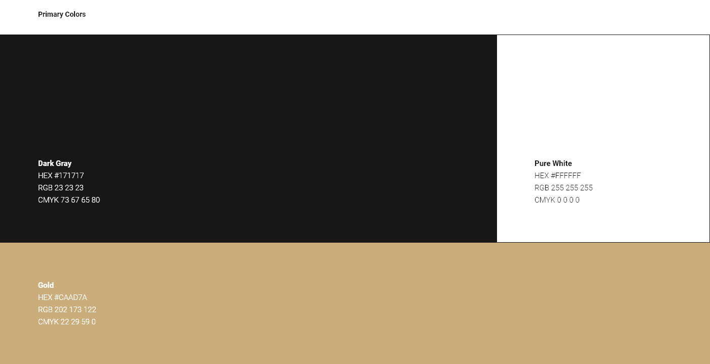
Colors Scheme
Colors are vital for communicating the right message and the balance between them have to be considered carefully. In this case, there are three main colors – dark grey, pure white and gold. As dark grey is dominant in the interior of the restaurant I decided to use it as a background to make a good connection. Adding gold immediately gives the brand high-end look which helps to reach our target audience. White is mainly used for content as it is the most legible option. The secondary colors are alternatives that could be used in some unusual cases or as supportive colors.

Typography
Roboto family has a dual nature. It has a mechanical skeleton and the forms are largely geometric. At the same time, the font features friendly and open curves. While some grotesks distort their letterforms to force a rigid rhythm, Roboto doesn’t compromise, allowing letters to be settled into their natural width. This makes for a more natural reading rhythm more commonly found in humanist and serif types. The typefaces will be used mostly in future brand elements such as menus, posters, and advertisings.

Taglines
Simple and catchy phrases will be accompanying the brand in order to make it memorable and remarkable. They are quite important as they will be used as the main tool to make the connection between the brand and its audience. Using Georgia typeface will make the lines fit into the brand overview. Some of the taglines will have a sense of humour and other will be more serious depending on the case. They will be used for outdoor and social media advertising.

Brand Elements
Creating a system of components which work alongside the logo is a key factor for a good branding. Keeping consistency while designing the brand components is really important, as they have to convey the same emotion and be recognizable.

Thanks for watching!


